Nextdoor: Registration and onboarding
What we did:
We overhauled Nextdoor's registration and onboarding flow to create a functional, unified, and clear experience.
Problem:
Nextdoor's registration and onboarding flow was hard to use and had a ~15% drop-off rate. Our aim was to fix functionality issues, unify the experience across platforms, and improve the first experience(s) for Nextdoor users.
Solution
We built a new flow prioritizing our users' needs. The new design allows users to create an identity, form connections, and increase the chance for a positive first experience.
We saw an 8.5% SWI lift, and 25k+ people join Nextdoor on a weekly basis (a 14% increase) from the redesign
Audit
To reduce drop-off and improve the initial impression of the app we created the principle that the screen either had to relate to identity or create a positive first experience.
An audit of the current experience across iOS, Android, desktop web, and mobile web revealed:
Inconsistencies: asking for different information based on platform, different navigation across the flow, mixed design systems, and non-inclusive asks
Redundancy: multiple invite screens, unnecessary complex language
Functional issues: screens cut off on mobile web, pairing unfamiliar form fields together, broken APIs
Design process
Audit
Collaborate with PM
Initial designs
Design review
Finalize designs
Bug bash
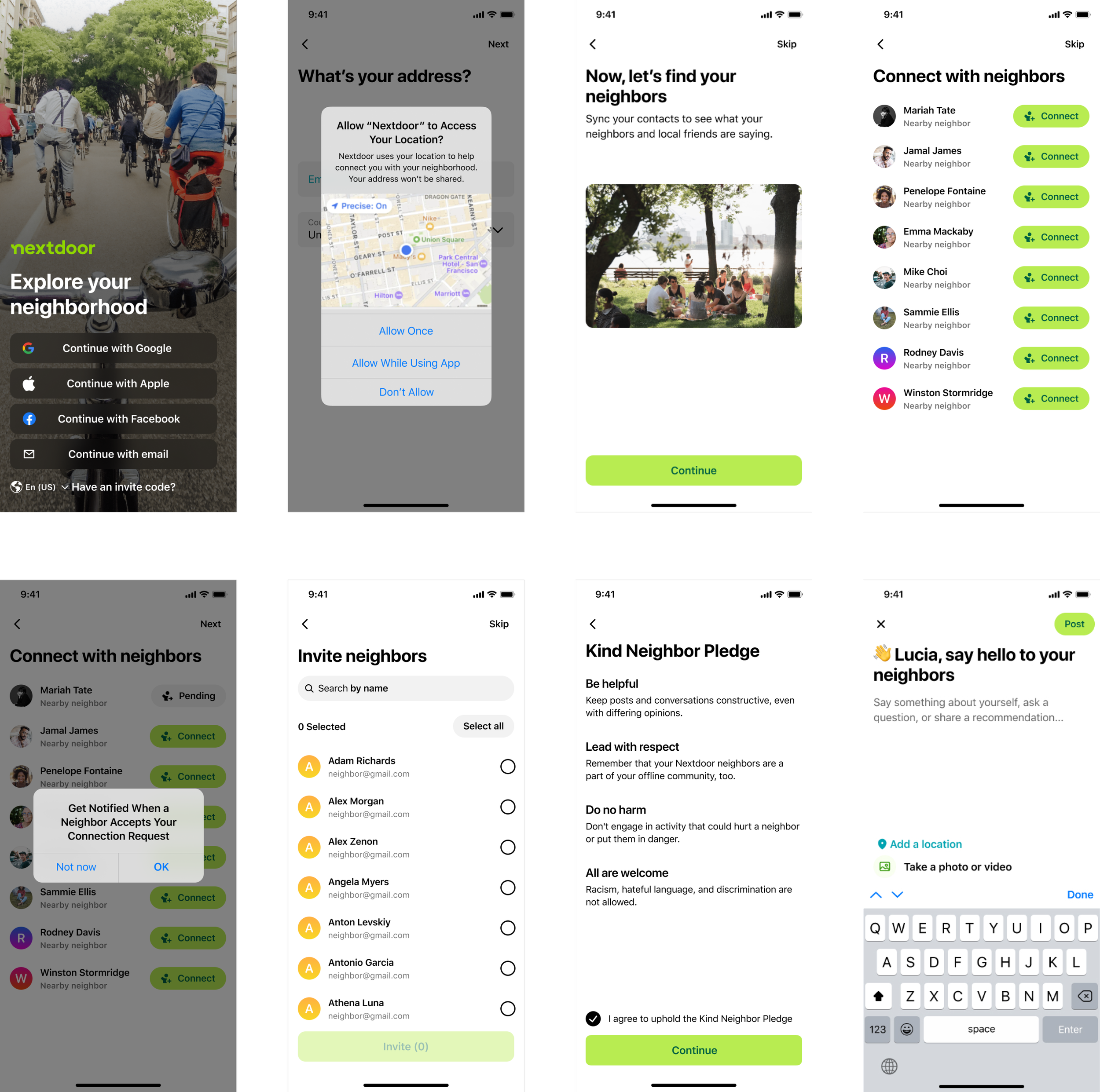
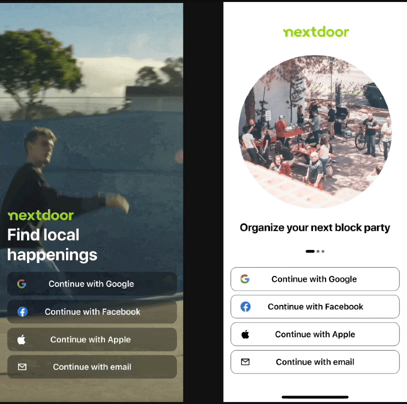
Laying the foundation - Essential screens
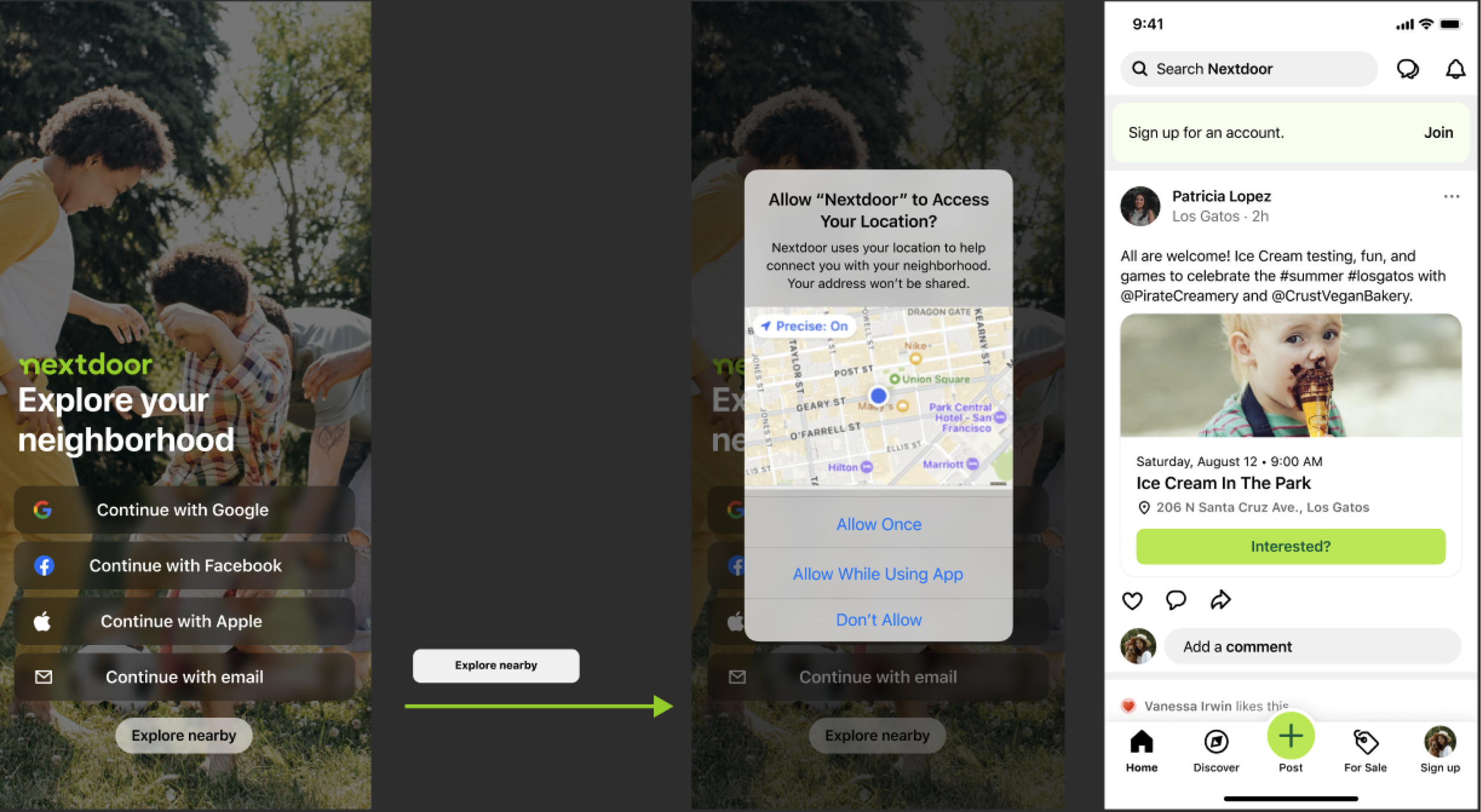
We referred to Mobbin to find out how other apps presented their onboarding flows. This revealed repeated patterns and allowed us to establish a familiar flow to most people.
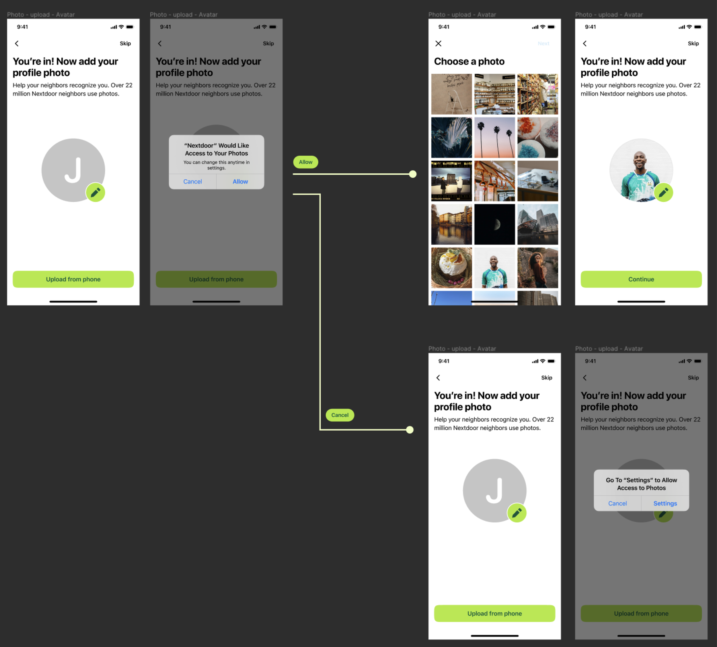
Using Figma, we focused on the essential screens to create a verified account - email and address. People could then form an identity on the platform by providing a name, and photo. We improved these basic screens by allowing 3rd party import, geolocation verification, web auto-fills, and improved search for addresses.
Design for an improved experience
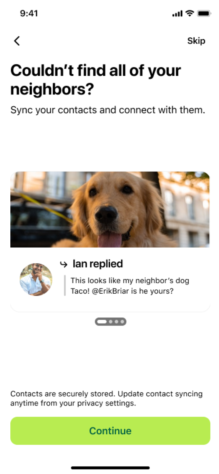
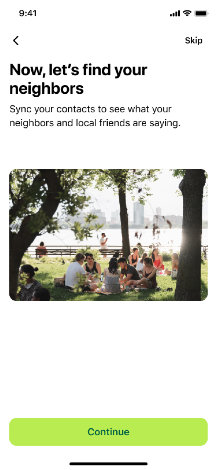
To improve the user's experience we included screens that allow them to connect with people they already knew on the platform. We then suggested inviting others to Nextdoor. This improves their experience by seeing people they know use Nextdoor, maintain social accountability for their posts, and grow their network through mutual connections. It also helps our business objective by building a growth loop.
We saw 25k+ new invites sent, and 6k+ new users on a weekly basis from these screens.
A design concept to explore Nextdoor before signing up
Technical limitations made this difficult to do
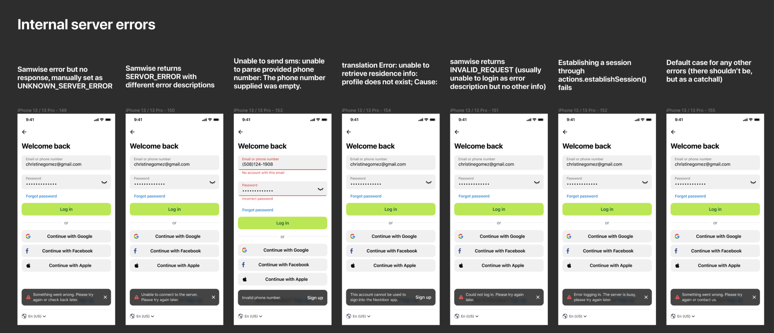
Designing for edge cases, and error cases
Worked with engineering to get all the unhappy paths a user may run into
Designing the for the full flow
Look for opportunities to create consistency across the product. The photo upload design here was reused in composer
Design for neighbor value
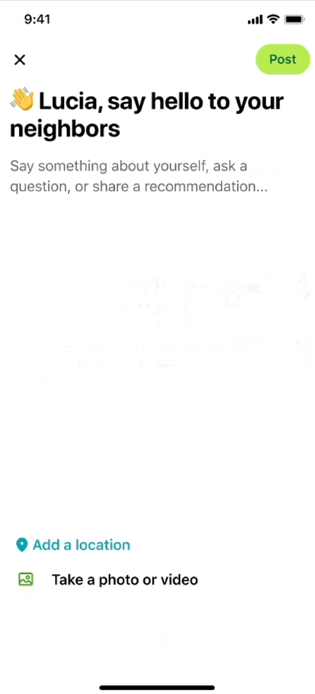
Finally, we added a screen for neighbors to introduce themselves. This helps them feel connected to their neighborhood, increases their chance of a positive first notification, and sets them up to ask their neighbors a question or recommendation before they hit the feed (#1 reason people sign up for Nextdoor).
Utilized Nextdoor's Blocks design system
Designed iOS, Android, mobile web, and desktop web for US and international markets
A/B tested key screens like the splash screen, invite flows, and intro post. We made informed design decisions based on information provided by our data science team
Worked with engineering to scope MVP, review technical limitations, and fine-tune design before launch
xfn collaboration
Voice
I worked with our copywriter to establish the sentiment and tone we wanted to convey throughout the flow
Data-driven design
I worked with data science to find areas that users dropped the most - such as entering their address or adding a photo.
Polish & Launch
Engineers, the PM, and I teamed up to find bugs before releasing
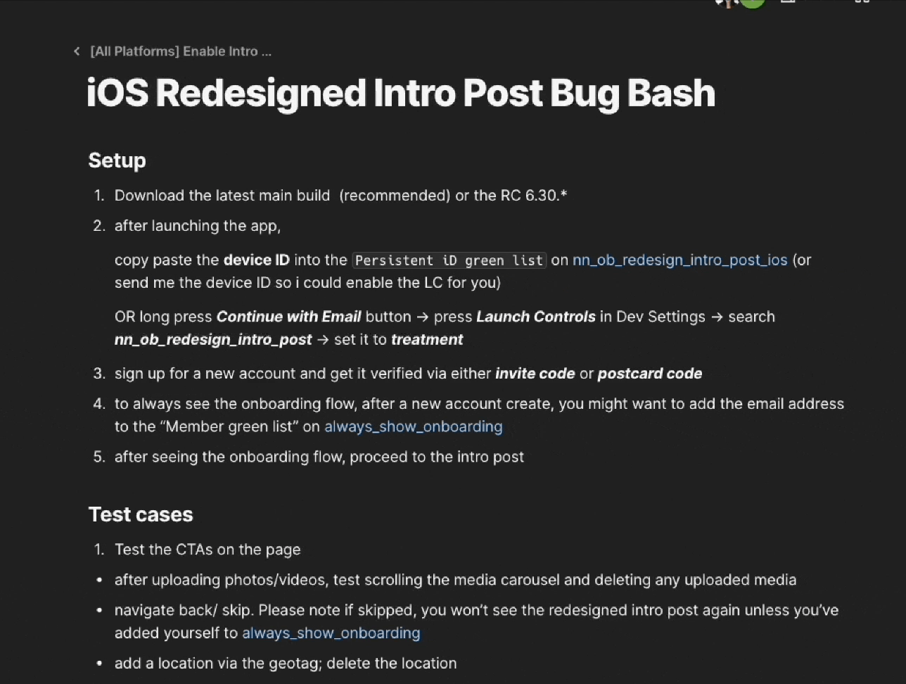
Polish: one of our bug bash sessions
Data-driven design: Examples of splash screens we tested that didn’t perform well
-
Miro
Figma
-
1 product designer
1 content strategist
1 project manager
1 EM
2 data scientists
6 developers
-
concepts and design: Q4 2022
build, bug bashing, testing and improvements H1 2023
Next steps
We created a modular onboarding experience so different teams across the organization can add and remove screens to improve the experience as users' needs change. We can improve the new user experience by focusing on their first 30 days of experience - first feed, emails, and notifications.
Learnings
This was a quarter-long project that encouraged us to rip out the existing new user experience. We had the opportunity to think about 1. what does someone want out of Nextdoor, and 2. how can we ensure they get that experience? We worked cross-functionally and presented to all levels of the company to validate and create this experience.
We were mindful to challenge our intuition on key screens through A/B testing. For example, the splash screen designs below didn't work as well as a simple static screen.
This project encouraged me to think more holistically about designing for the user, rather than focusing on incremental change, or anchoring to an existing product experience.